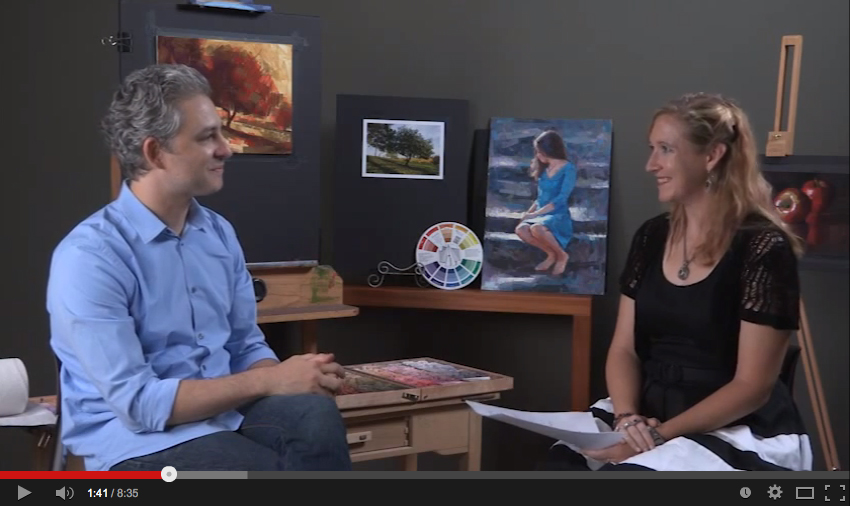
designing a still life

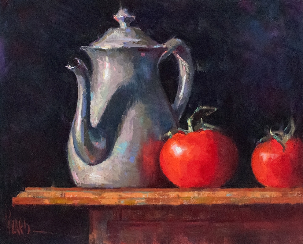
Great paintings don't just leap off the easel as a result of the ever-brilliant hand of the artist gracing the surface of the paper. No, great paintings are the result of careful planning, thoughtful design, and patient execution. Have I removed all the romance for you yet? Not to worry, there is still much inspiration in the process.  If you're not too discouraged, then continue reading to see how I created this simple still life using vine ripe tomatoes and an antique pewter teapot. There is always beauty to be found for all who are willing to quiet themselves and really look for it. 

Step 1: arranging the objects

The first thing I did was buy some vine ripe tomatoes at the local grocery store. I love the lush color, round shape, and wonderful greenish accents of the vines that these rotund vegetables provide. I bought this pewter teapot at a church tag sale in Rockport, MA during a weekend holiday visit there two summers ago. I've been waiting for the opportunity to employ it in a still life painting ever since. With a spot light setup left of the table and slightly above horizontal, I created some dramatic light and shadow patterns on the objects while arranged them on the surface of a small antique table. I also hung a dark blue backdrop behind the subject to create a rich, deep relief for my painting.

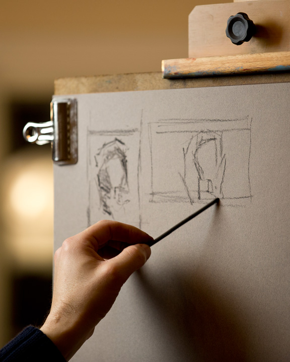
step 2: the thumbnail sketch

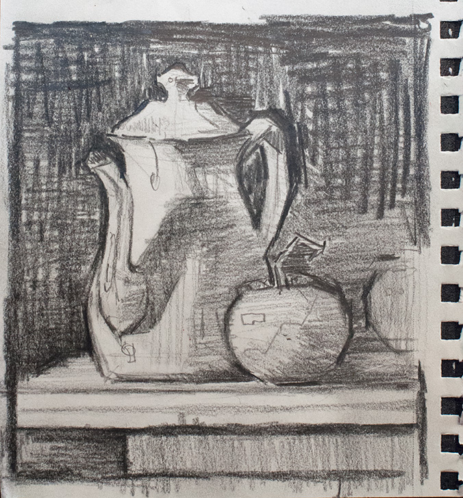
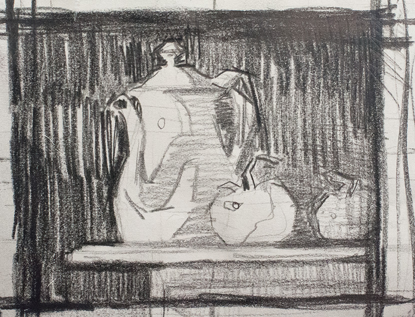
Once I have a setup that I'm interested in, I pick up my soft Ebony pencil and a small sketchbook, and I begin to design the painting. I tried two approaches, which you can see in the slideshow, and settled on a design that was horizontal, picking up on the profile edge of the table. In order to do this, I sat in front of my setup from a low angle, keeping the table directly at a 90 degree angle from me, and the top of the table at eye level. This creates this striking horizontal surface to show off the teapot and tomatoes. I also wanted to crop one of the tomatoes as a lead in shape. Thumbnail studies are about problem solving, not gorgeous little drawings. In them I clarify the shapes, simplify the values, and design the composition. When I've done those three things, I move on. 

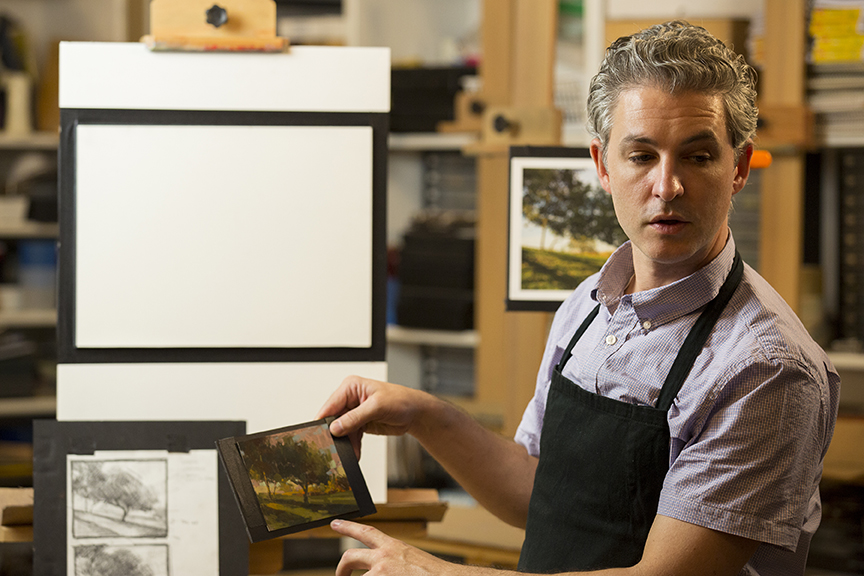
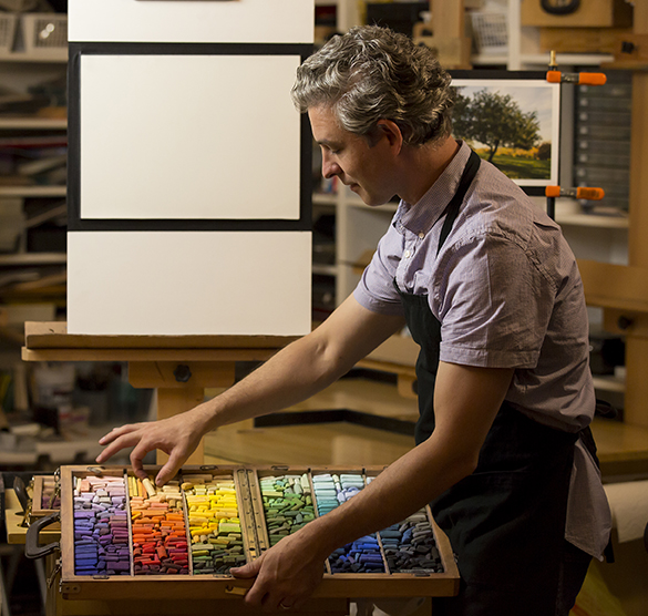
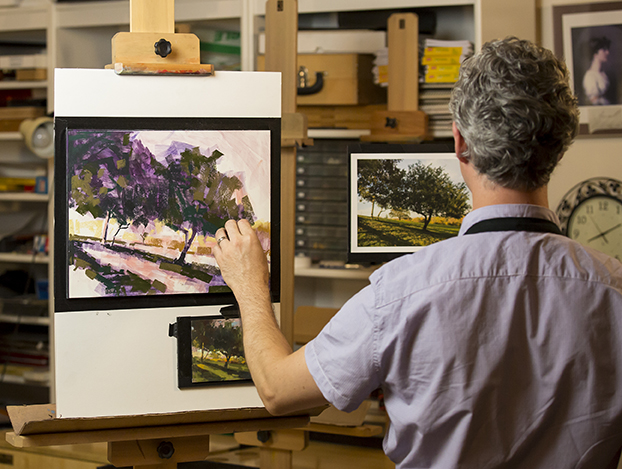
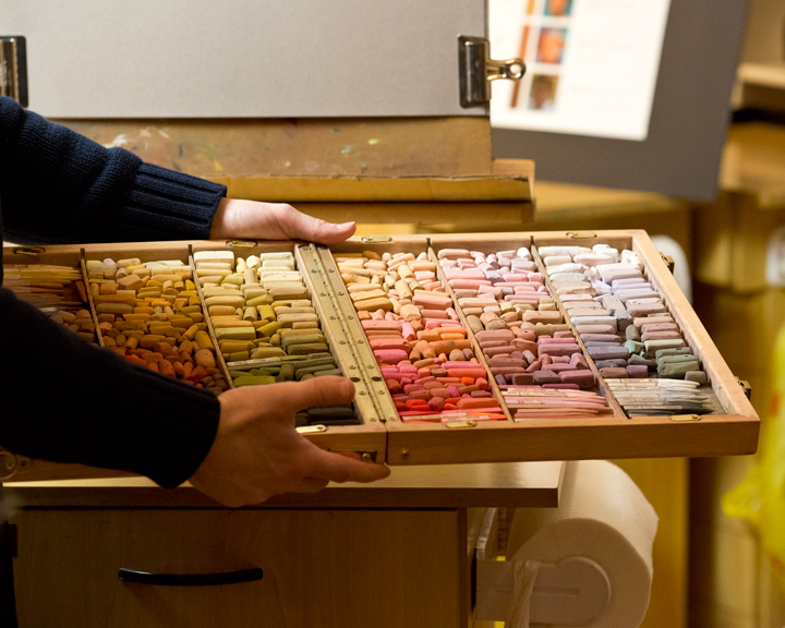
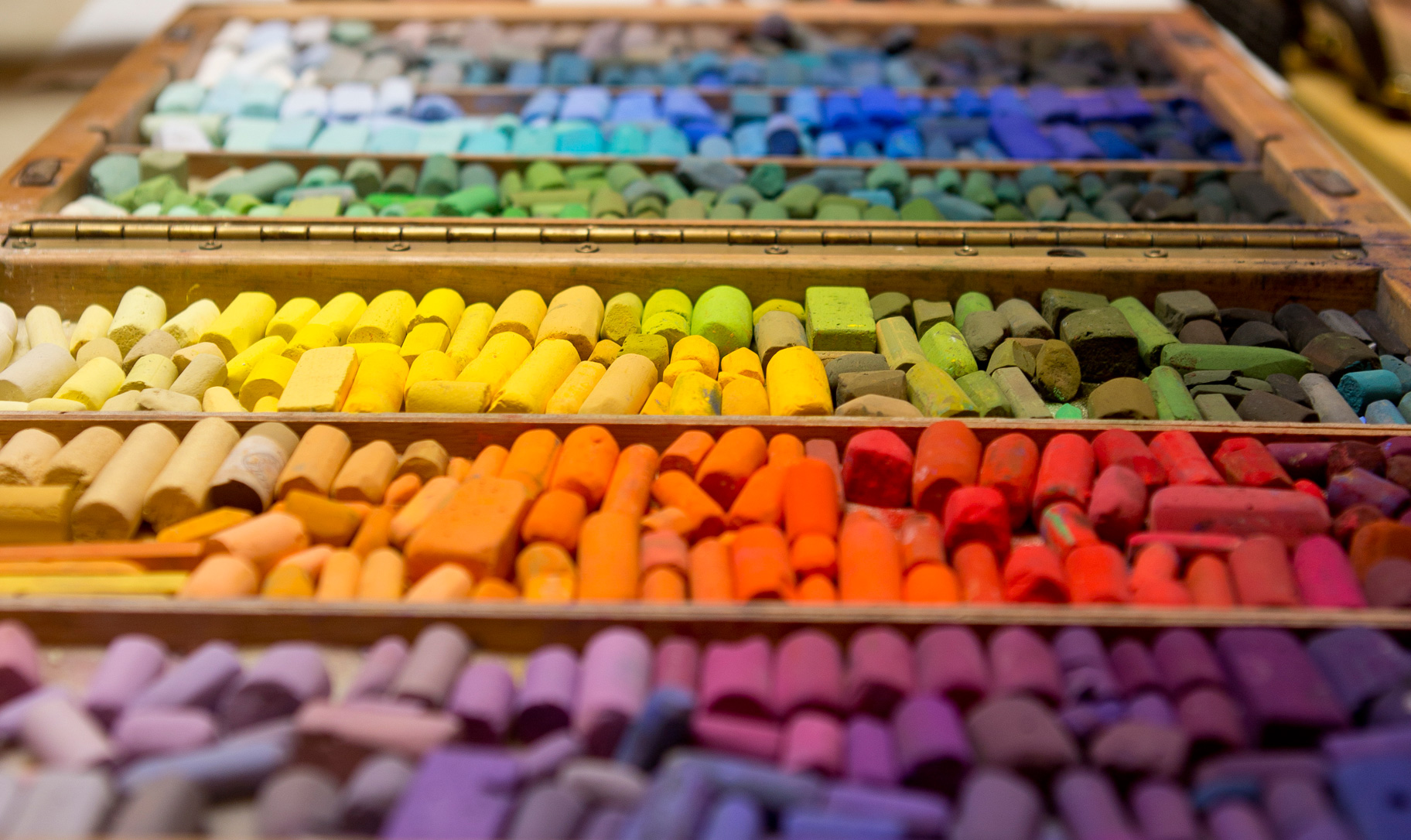
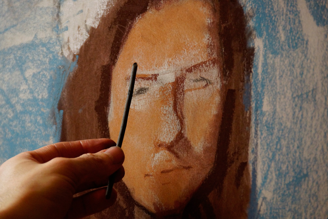
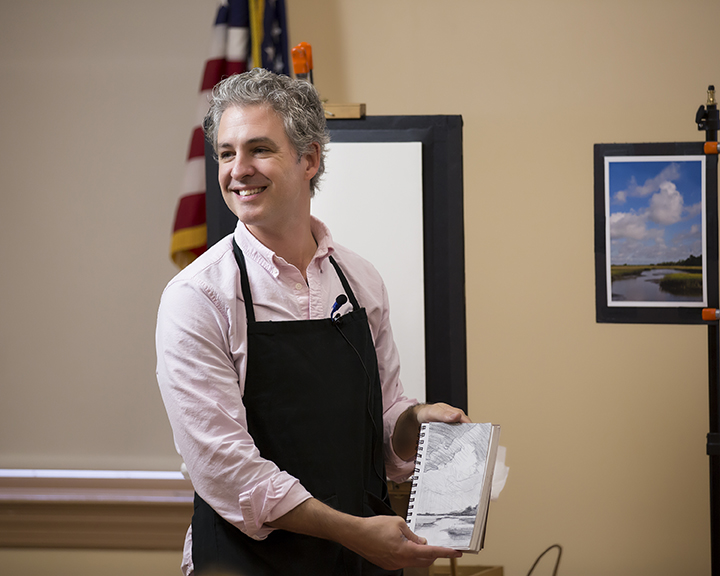
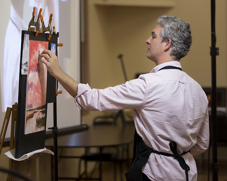
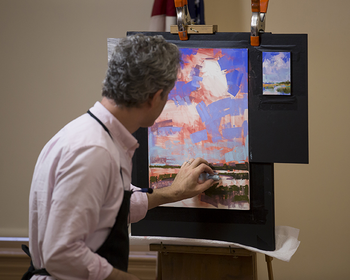
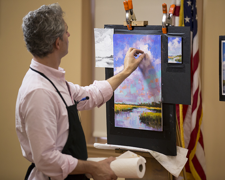
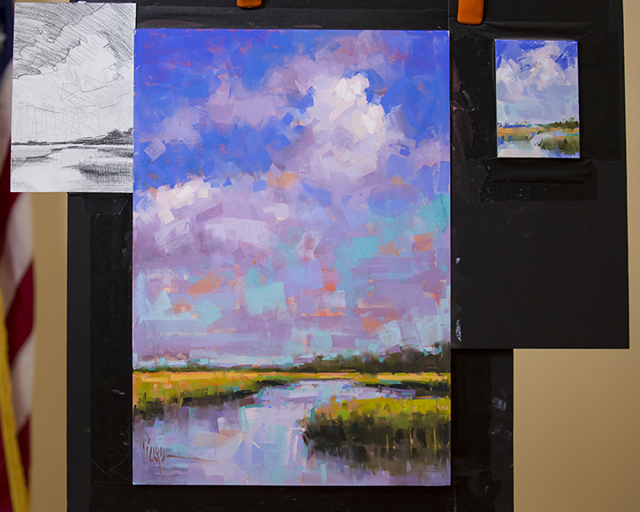
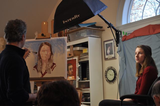
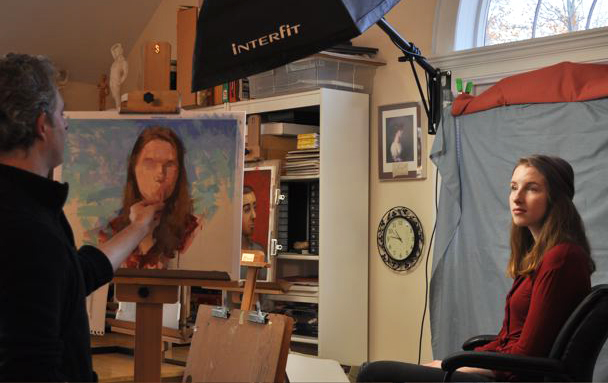
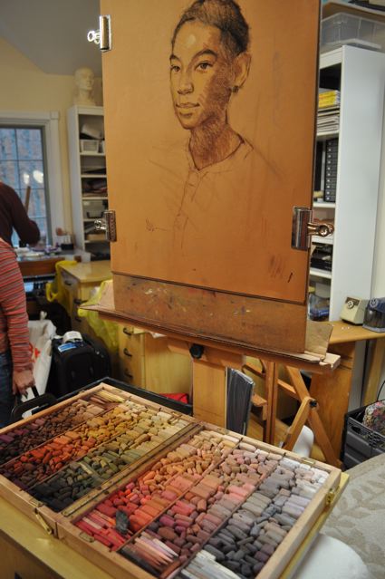
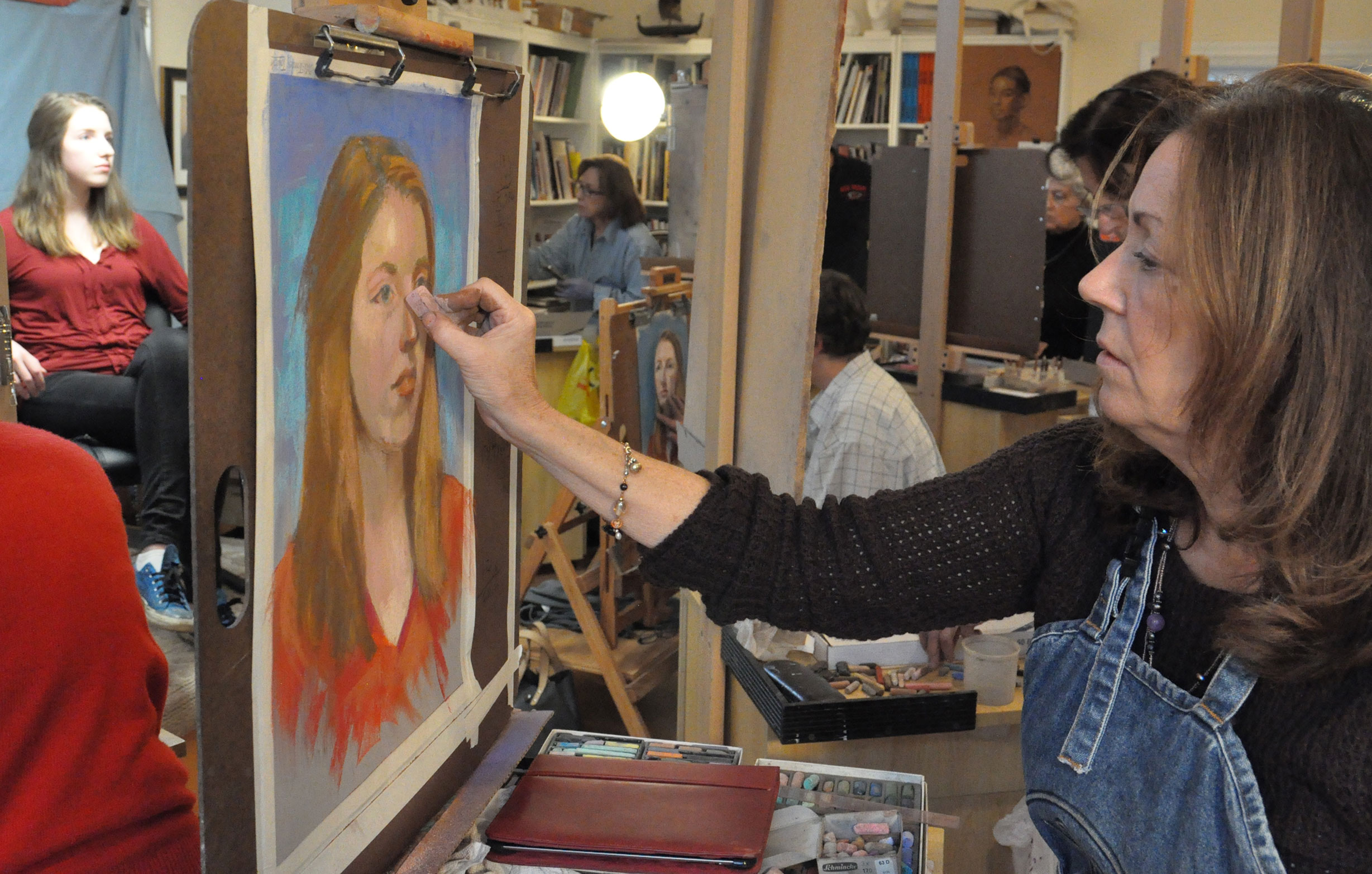
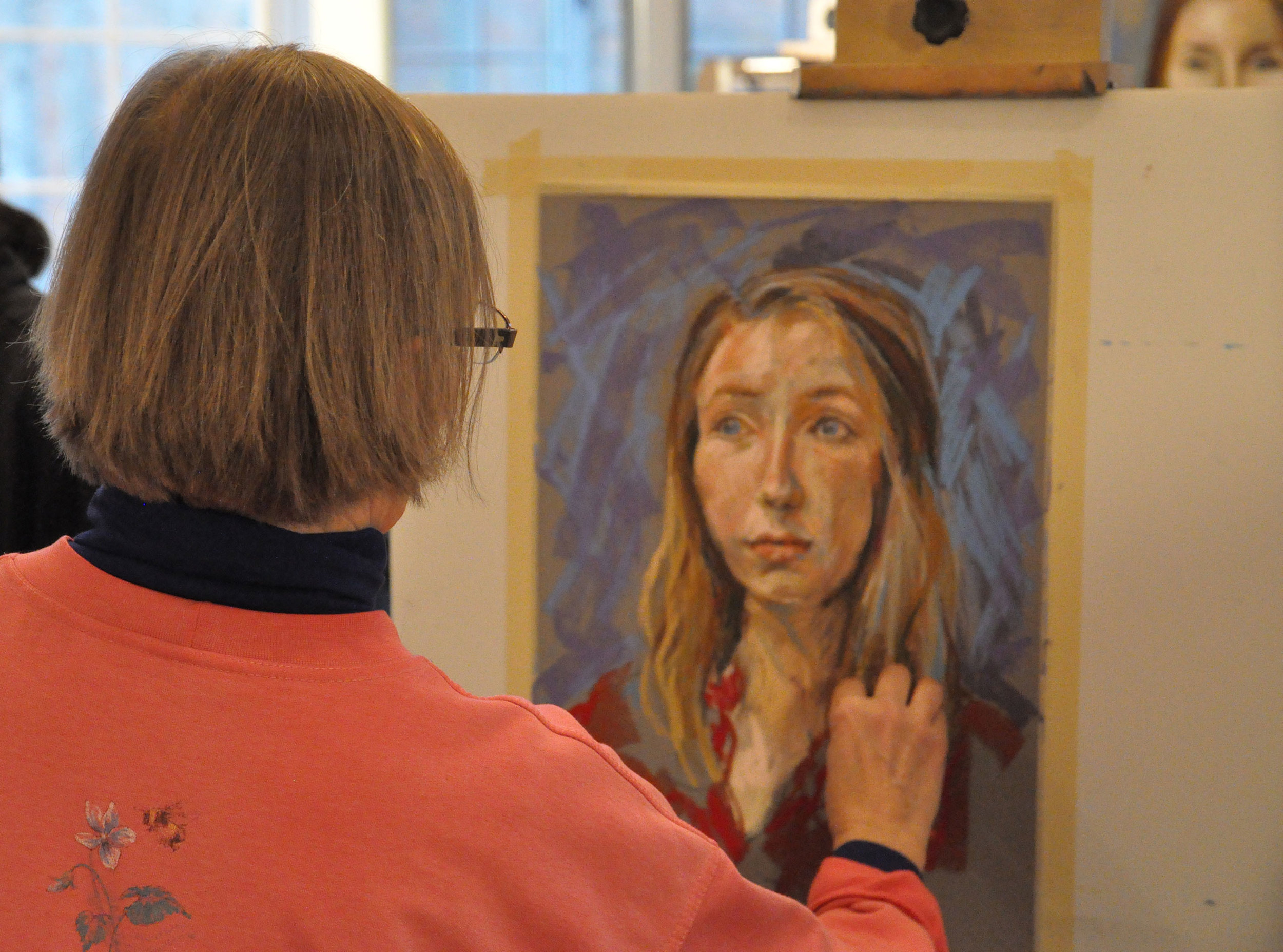
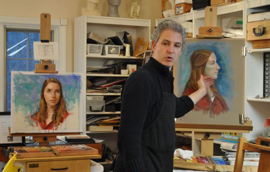
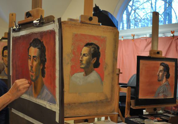
step 3: The pastel painting

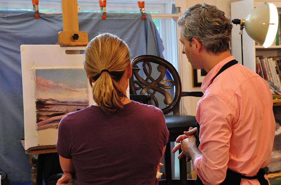
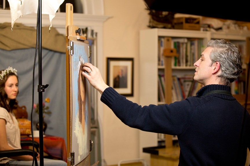
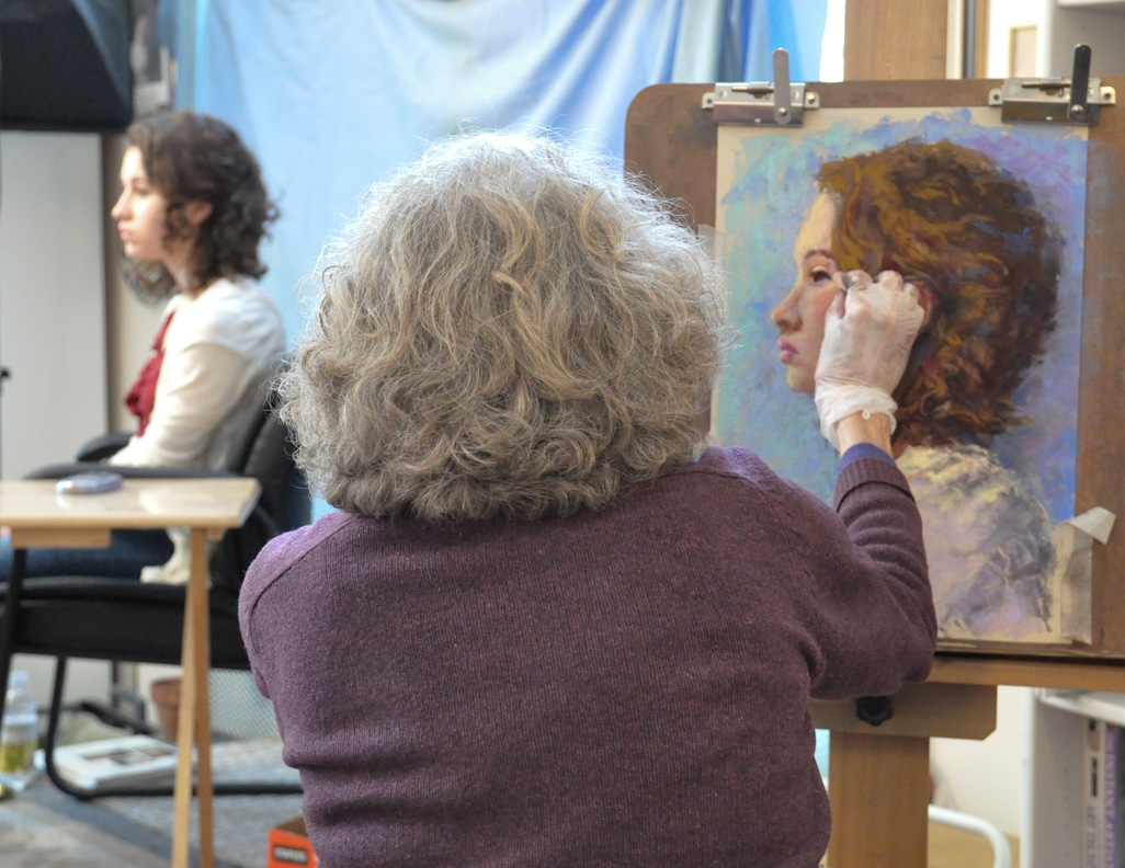
I had a piece of 10x12" Wallis Museum Grade Paper in the studio mounted to Gatorboard, so I used it for this painting. The first step was to recreate the drawing blueprint with extra soft vine charcoal on the white paper. Once that was done, I jumped right in with soft pastel and developed the big masses of the painting, starting with the darks and working toward the lights.  You can see me working from life in my studio in the image slideshow above. What a joy it is to take the time to really design the painting, and to slowly develop the shapes until you realize your initial vision. Looking at sketch #2 in the slideshow, you can see that this vision was realized in the final painting. 

My NuPastel Portrait Palette Colors

Artists often ask me which brand of hard pastels I use, as well as what specific colors are in my portrait palette. Well, to answer this question once and for all, I've created a chart of my favorite NuPastel portrait colors, along with a collection of grays that I keep in my portrait palette. I purchase these NuPastels in single sticks online from resellers like Jerry's Artarama. All the numbers on this chart correspond with the official NuPastel color chart numbers, so you can easily order them yourself. If you want to learn how to sharpen these to a point, watch my video where I given a demonstration. I hope you find this helpful!

Interview With Cherie Haas, Online Editor, Artists Network

While on the set with ArtistNetwork.TV to create a new video series, I had the opportunity to share a few thoughts on art during an interview with Cherie Haas. In PART 1, we discuss why I love pastels, my artistic muse, and my process for setting up a still life.
In PART 2,  Cherie asks me about one of my favorite "A-ha!" moments that transformed my work. We also discuss my series, Reflections of Hope which depicts the people of Rwanda, and how I attempt to invite my audience to look more deeply and care.    

Watch Part 1               Watch Part 2

Landscape Demonstration & Portrait Workshop

I had a wonderful time last month giving a painterly landscape demonstration for Pastel Society of New Jersey. I have some pictures to share, compliments of John D. Helm Photography.

LIFELIKE PORTRAIT & FIGURE PAINTING Workshop

I hosted a three day portrait workshop in Southbury CT this month with a wonderful group of artists. Here are some pictures of my demonstrations as well as student work. 

Pastel 100 Competition

My painting entitled, The Bride, has been awarded Second Place in the Portrait/Figure category of the 16th Annual Pastel 100 Competition.  I'm grateful to my friend, Josie, who posed for this painting. I'm also grateful for the amazing Pre-Raphealite artists like Waterhouse and Rosetti who inspired me with their own depictions of victorian brides. Most of all, I'm grateful to God, who has given me the ability and opportunity to create.

“My beloved is mine and I am his…”.  Song of Solomon 2:16

The Bride 23 x 16" pastel

The Bride 23 x 16" pastel

"Glimmer" in the IAPS Show at Vose Galleries

Thrilled to be showing in, "The International Association of Pastel Societies' 24th Juried Exhibition at Vose Galleries"

On Saturday, May 10 from 2:00 p.m. to 5:00 p.m. the public is invited to the opening festivities at Vose Galleries, 238 Newbury St., Boston, which will feature an afternoon of artist demonstrations and tours of the exhibition

The International Association of Pastel Societies (IAPS) is pleased to announce its 24th Juried Exhibition to be held from May 10 – June 21, 2014 at the venerable Vose Galleries of Boston. This IAPS exhibition will feature soft pastel paintings by 76 contemporary artists, selected from over 850 entries. Hailing from twenty-nine states, British Columbia and Alberta, Canada, and Queensland, Australia, the finalists are some of the most prolific and important contemporary pastel artists in the world. The show will display how this luminous medium is inspiring artists and advancing the quality, prestige and value of pastel painting.

Weekend Portrait Workshop

I recently taught a weekend workshop with a group of inspiring artists as we developed our portrait techniques and approaches. What a wonderful time we had together!

The weekend began Friday evening with a full portrait demonstration in pastel. 

It's so exciting to see workshop participants push themselves right out of their comfort zones to apply these new techniques and learnings to their work. The results are always amazing!

Delayed Gratification

I’ve been working on a pair of heirloom portraits for months now. These life-sized, oil on linen portraits of two lovely siblings have been developing steadily under my constant care. Every stage of the process stewarded with the greatest attention to detail and ongoing collaboration with the wonderful family I was commissioned by. We’ve charted quite a journey together bringing this art to life.

studio_548blog.jpg

You know, sometimes we paint for immediate gratification, and enjoy the finished result in just a few hours. Yet at other times—in an effort to create work that will benefit generations to come—we paint with a much longer-term view. This kind of creative work requires much patience and perseverance, but it's well worth the wait knowing that I’m creating art that will last. Perhaps in art-making, as in many areas of life, greater satisfaction is derived from delayed gratification. Looking forward to sharing the finished products with you very soon!