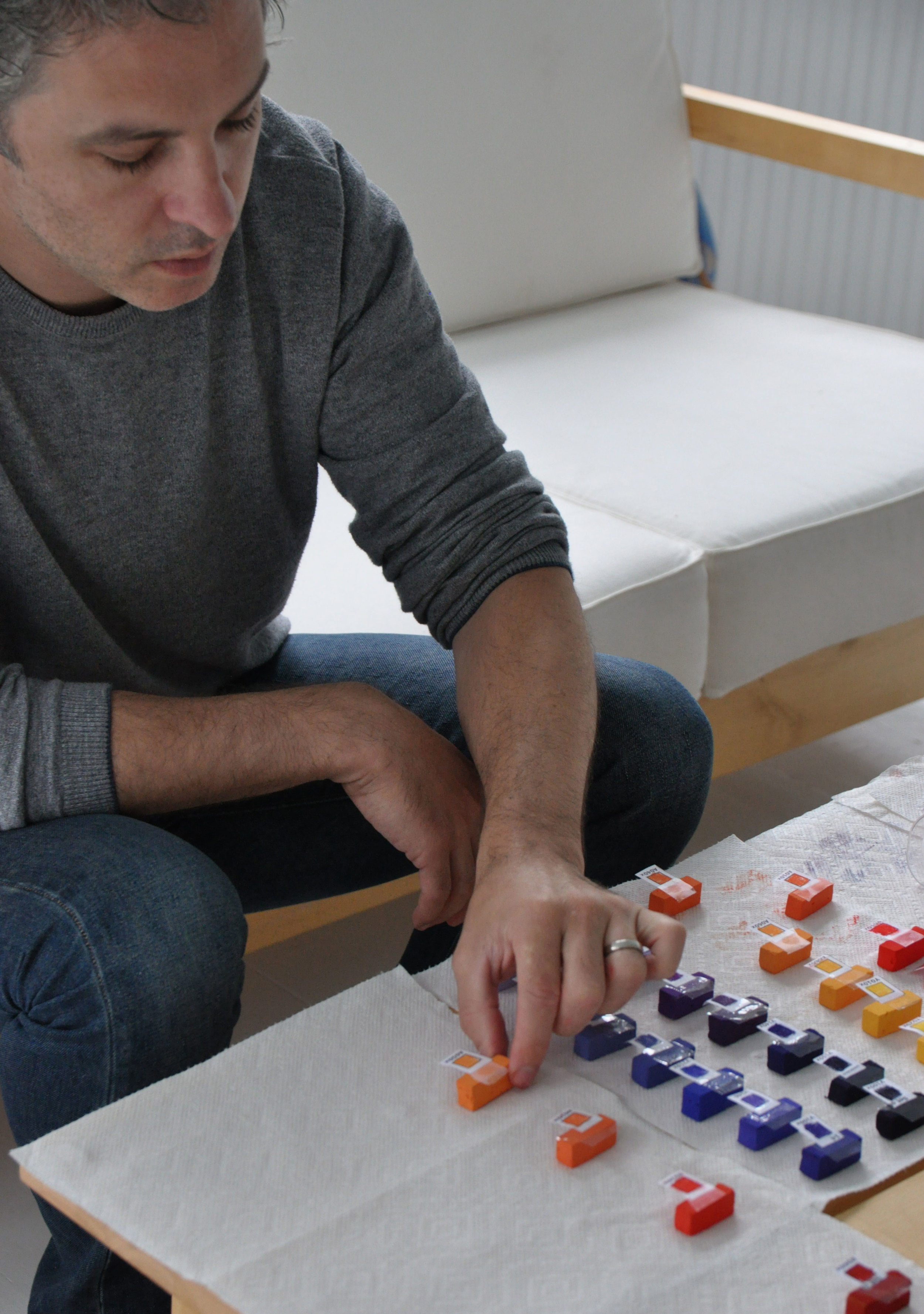
I have been inspired to create a series of artistic works in response to my recent trip to Southeast Asia. It was an extraordinary journey, allowing me to see many things both heartbreaking and breathtaking. Since my return, I have started creating work in response to these experiences. “Reflections of Hope: Cambodia,” is my personal reflection on the people, places, and stories of God’s enduring grace, revealing the beauty found in the midst of the brokenness.
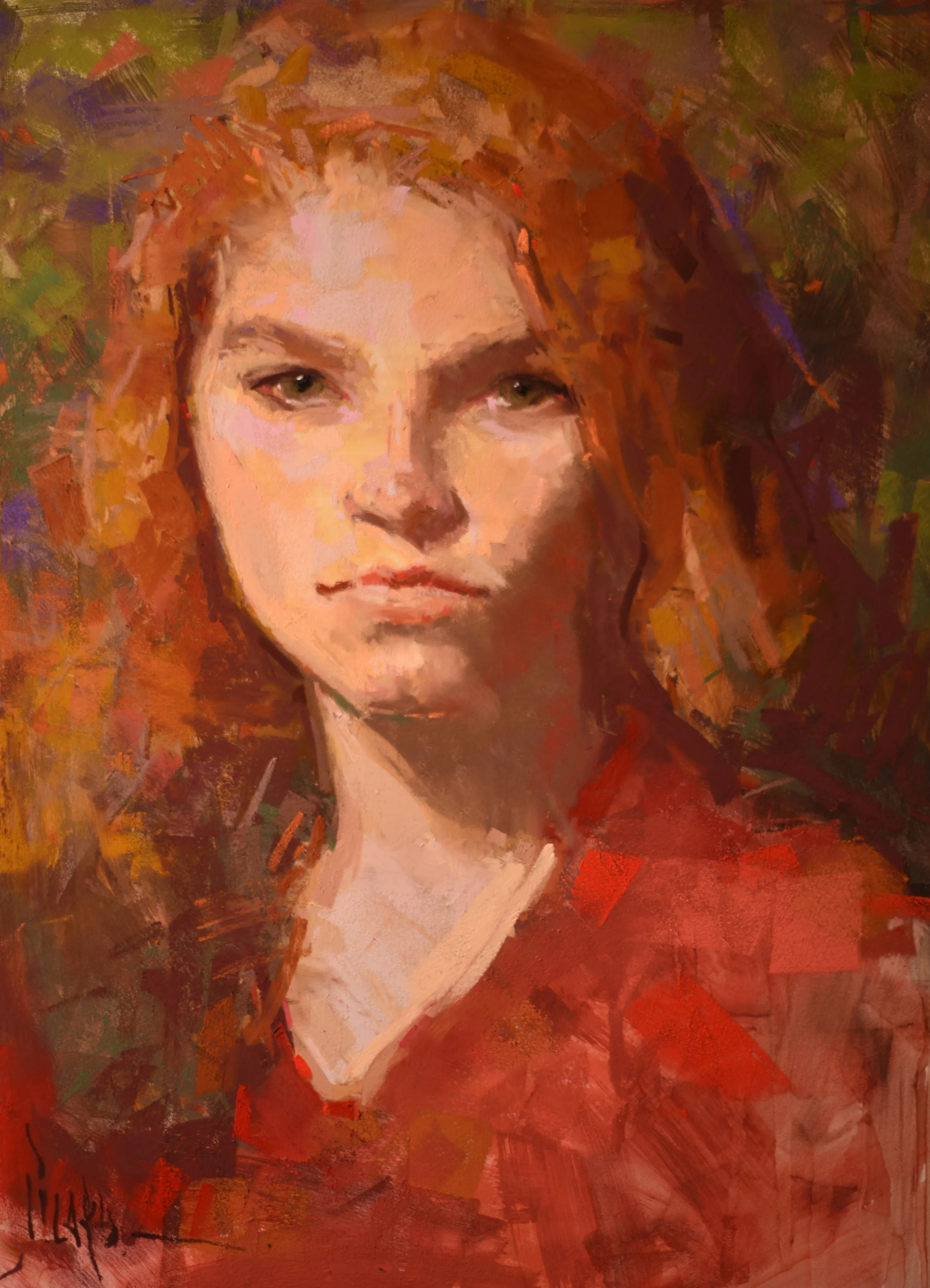
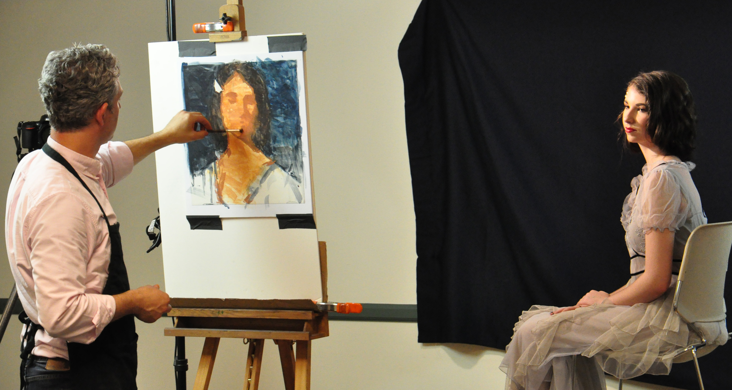
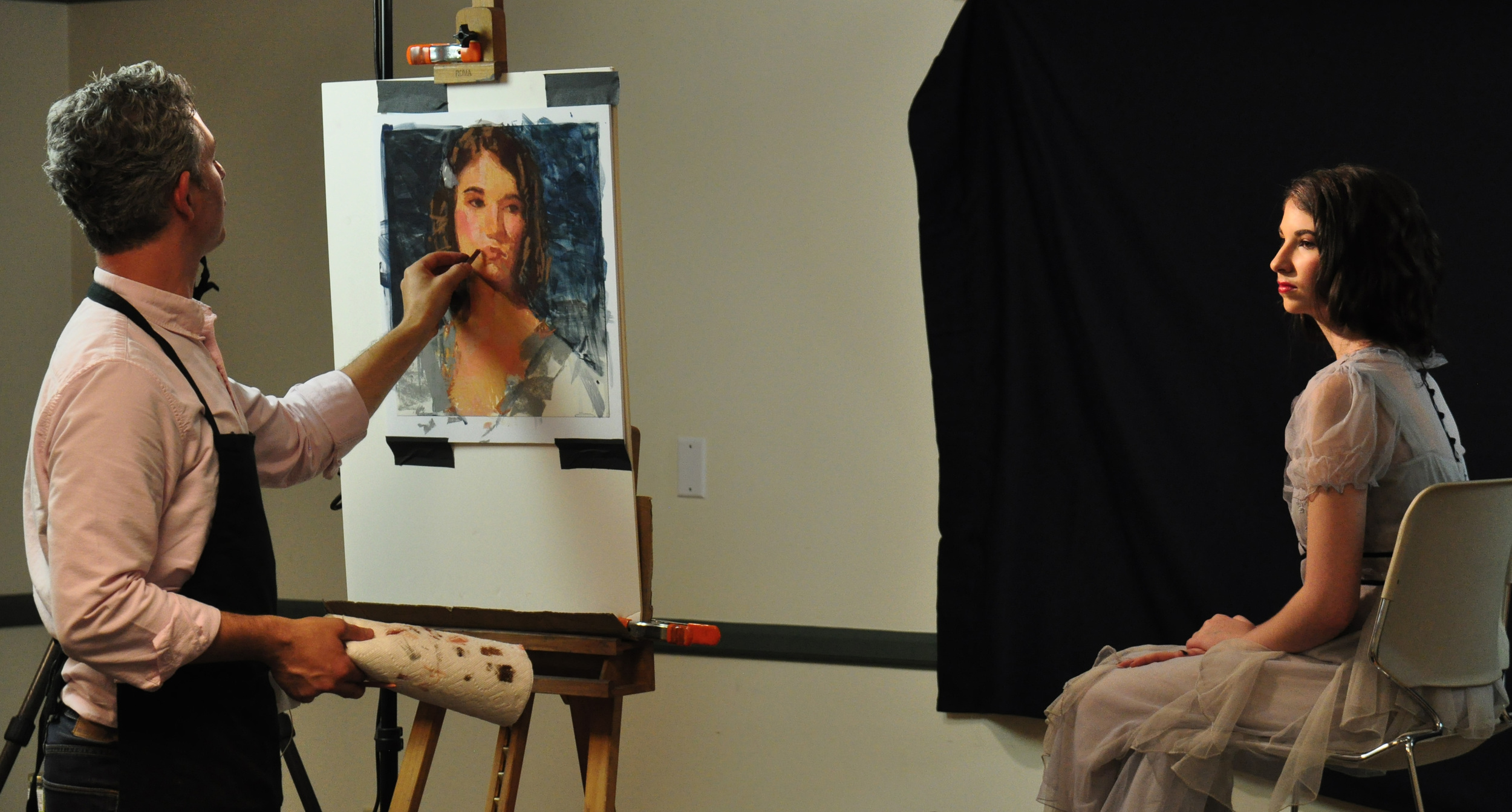
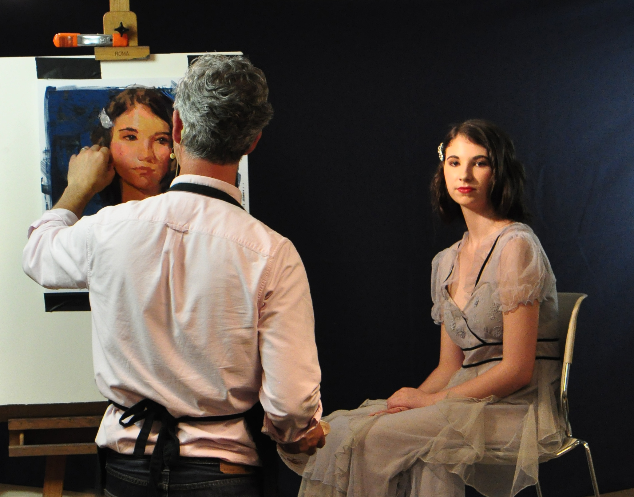
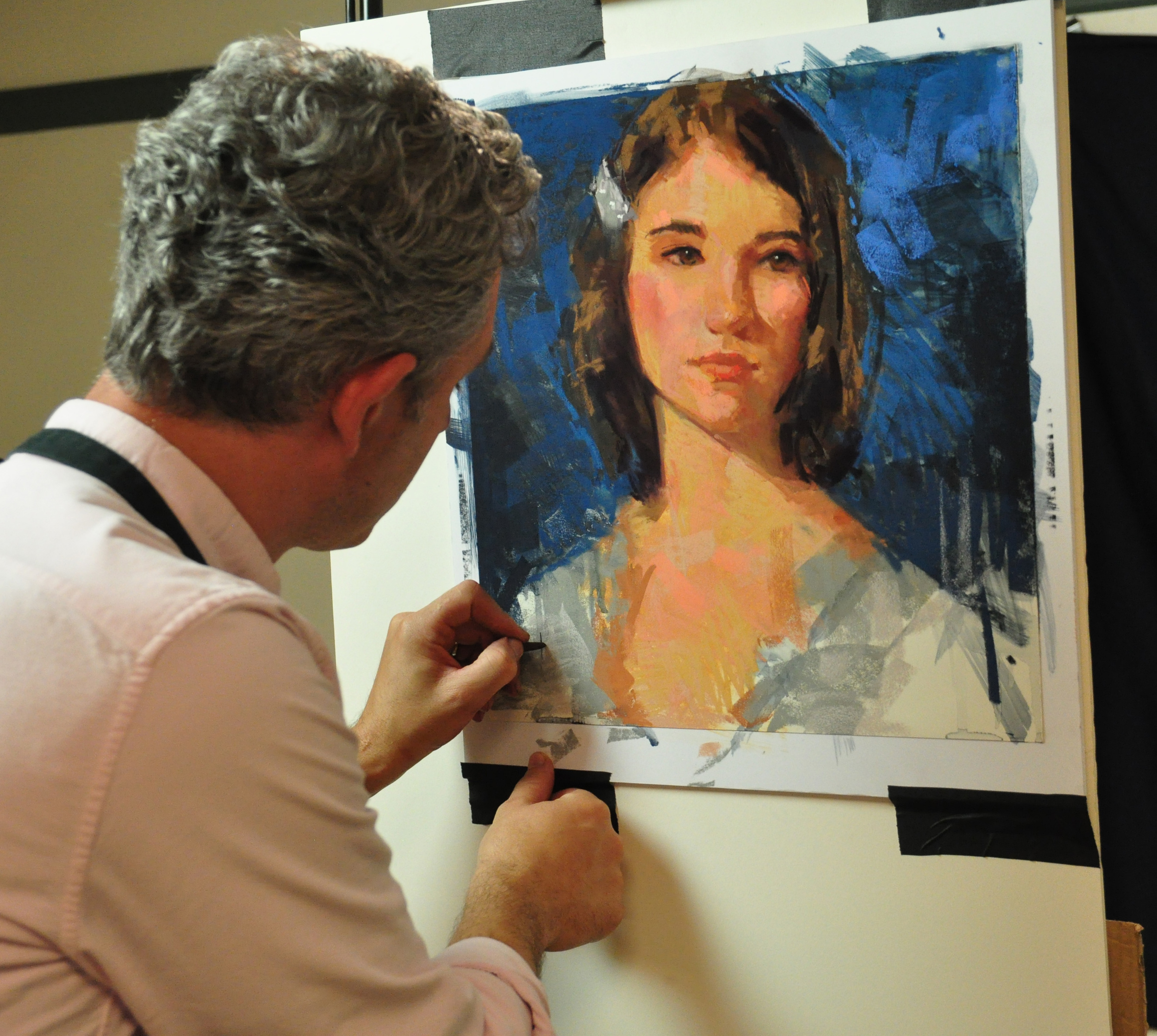
“An Unfinished Story,” is one of the very first works in the series. This portrait in pastel is based on a young girl I met at a wonderful church in the center of Phnom Penh. Though I didn’t get to know her personally, she was one of the children taking part in Vacation Bible School at the church, and probably an orphan living nearby. As you can see, she is quite beautiful. Much like Cambodia, this precious girl’s story is still unfolding. I wonder what might happen to her, and whether she’ll experience great opportunity or grave danger in the days ahead. Both are very real possibilities.
In shining a light upon the precious people and extraordinary places I’ve seen, I hope to awaken the viewer to consider their own response to this unfolding story. One that exposes great pain and injustice, yet also summons us to participate in a noble work of restoration. I believe that hope is found in the midst of our response to the problem. For as we engage with issues of injustice, we discover that each of us holds the potential to change our world.
I hope you will join me in imagining a new chapter for Cambodia. One that is full of hope and healing as we join together to make a difference in the lives of people like her. To find out more about my experience in Cambodia, visit my REFLECTIONS OF HOPE: CAMBODIA webpage.
MAKING A DIFFERENCE
Premier Limited Edition Prints are now available in the online store. In my own effort to support the work of restoration in Cambodia, I'm donating 30% of the proceeds from the sale of these prints to FOUNTAIN OF HOPE, an extraordinary ministry doing great work in Cambodia.
Be Inspired,
AJ