A symphony of edges

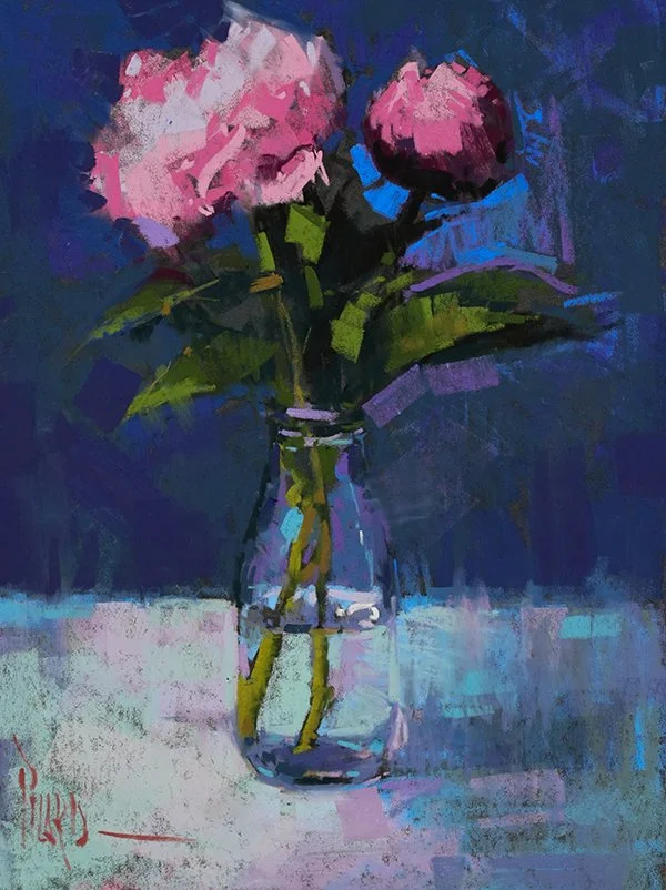
Look closely at these radishes for a moment.

Radishes, 12x9” Pastel on LaCarte

Notice how some edges are crisp and sharp, like the bright snap of light on the cut radish. Others melt softly into shadow. Up in the greens, the marks break apart and let the air pass through. And at the bottom, the darkest radishes dissolve into the background until you can't quite tell where one ends and another begins.

Hard, sharp, soft, broken, lost. Together, that variety creates a symphony in the painting. It's what makes the ensemble breathe with life rather than feel stifled.

If that symphony had a name, it would be called Edges. Truth is, I've been a bit obsessed with edges for years.

What pulls me in is the way edges create an airy atmosphere, imbue a painting with mystery and mood, and bring a sense of focus, dimension, and depth, even within the compressed space of a small still life.

Hearing the sound of the surface puts me in good company. James McNeill Whistler titled his paintings like music, his Nocturnes, Arrangements, and Symphonies, because he understood that a painting is built from relationships of color, value, and edge. That same language runs through every subject I paint.

Spring Daffodils, 9x12” Pastel on UART 400

Take the daffodils, glowing yellow against deep blue. They tell the very same story, broken color, crisp accents, edges lost and found. 

Two totally different paintings, one thread weaving through them all.

If your eye is drawn to loose, expressive, atmospheric work, that pull you feel is the painter in you. And this thread, the rich variety of edges, is how you begin painting that way yourself. It's the heart of a looser, more painterly style. Best of all, it isn't a gift some artists are simply born with. It's a language, and it can be learned.

Which is why I'm so glad to share something new with you. 

I've taken everything I've learned from years of chasing after edges and poured it into a new mini course. My little symphony for pastel artists is called Edges.

In it, you'll learn to see, understand, and create the full range of edges in your own work, using simple still life subjects like the very radishes and daffodils above. By the end, you'll look at your subject with new eyes and start painting work that truly breathes.

Here's what's inside:

  • 4 lessons across 10 videos, including 3 painting demonstrations

  • A growth exercise with every lesson

  • The downloadable Edges Guide PDF and supply list

  • A bonus challenge, plus lifetime access to revisit anytime 

Self-paced, with lifetime access.


Come explore edges with me, 

Alain

How to Paint the Golden Hour: Capturing Summer Light in your Paintings

Let’s take a trip together.

Come with me to a special place. To that hour, near the end of a summer day, when the sun sets aside its ordinary work of revealing the world and becomes a painter.

The light drops low and turns generous. Spilling across the field, it catches the edge of a shoulder, sets the grass aglow, and for a few minutes the whole world looks like something worthy of our full attention. Then it fades away.

Summer Gold, Alain Picard, 14x11” pastel on UART

It always fades. That’s the part of what makes the moment so precious.

We are the ones who take notice. While others walk past the glow on their way to dinner, we stop to soak in the wonder. Because artists see beauty, and search it out. We set the stage, wait for the right time of day, and hold still long enough for the muse to visit us. 

We are stewards of the light. Gathering its glistening beauty into pictures to share with those around us, so they too can discover the magic of the moment.


This summer, search out that golden hour. You may find it by the sea, in an open field, your own backyard, or somewhere far from home.

Bring a camera, a sketchbook, pastels, or simply your full attention. Stand in the last warm light before it slips away, and let it change you. Then capture your experience on paper, so the rest of us can feel it too.

The light is already on its way. Where will you meet it?

Keep painting, 
Alain

Your Summer Portrait Adventure

There's a particular magic to summer light on a child’s face.

Meet Tillie and Lulu, two sisters I painted as family heirlooms in the full flush of summer greens. The garden behind them, the warmth on their skin, the quiet strength in how they hold your gaze. I wasn't trying to capture every detail. Just the wonder of childhood, suggested with color and light and a few well-placed marks to convey the likeness.

Portraits of Tillie and Lulu, Private Collection, 24x18” pastels

That's the heart of portrait work. Let’s face it, likeness matters, and capturing it is what we're after. 

The freedom comes in learning to convey that likeness with a few well-placed contours and foundational shapes, so the work can breathe with loose, airy life. You can hold the likeness and the spirit at once. 

The uniqueness of a child, and the sense of wonder, in the same few marks.

Summer is a generous season for study. The people you love are close, the light is abundant, and there's time to slow down and really look. A portrait made now becomes the kind of thing a family keeps for generations.

Would you love to create a portrait of someone in your life this summer?

The Painterly Portrait self-study course walks you through the whole journey: the confidence to begin, the technique to see and describe what's in front of you, and a clear step-by-step process from first marks to finished piece. You can move at your own pace, anytime. 

Why not make it your summer adventure? 

Faithful friend, fearless guardian

Behind my friends' home, there was a small farm. A chicken coop, a horse in the field, a few goats wandering through, and four joyful daughters coming and going in the midst of it all. Watching over every one of them was Bear, a Maremma Sheepdog the size of a small bear himself. Hence the name.

You really cannot appreciate just how big this dog is until you stand next to him. He warded off coyotes at night, kept the chickens safe, played with the goats like they were his own siblings, and looked after those four girls as if it were his sworn duty. Bear lived outside in his element, content in his place at the heart of that family.

Bear, 12x12” pastel

When I went to photograph Bear for a painting, I found him right at home, out among the animals he loved. The portrait above came directly from that afternoon at the farm.

This painting of Bear highlights something I want to share with you this week. The most important thing to capture wasn't his coat, or even his likeness exactly. It was his spirit. That watchful, playful, gentle, enormous spirit. And spirit, it turns out, is exactly what the painterly approach aims to reveal.

There is a freedom that lives inside loose, expressive painting. The marks suggest more than they describe. Color carries feeling. The eyes, big contour shapes and a few telling edges do the heavy work of likeness, so the rest of the painting can breathe.

A handful of accurate shapes and well placed darks will carry more recognition than hours of carefully rendered fur. Fresh color brings a pet to life in a way that gray toned realism rarely reaches. And the love and familiarity you already have for your subject will find its way onto the surface, if you give yourself permission to stay loose.

Blue & Gold Macaw, 15x10” pastel

This approach works across species, too. The same painterly thinking that brought Bear to life carries a brilliant blue and gold macaw painted on a dark surface, pulling vibrant feathers out of the shadows with bold direct strokes of soft pastel. These animals come from different worlds, yet carry the same painterly heartbeat.

If you'd like to explore this kind of painting for yourself, I'd love to invite you into my Painterly Pet mini-course. It is a focused journey through evaluating your reference, designing your portrait, and painting two different pets in two distinct ways. You'll work through the painterly approach with a dog painted on a light surface (yes, Bear is the demo), and then take a walk on the wild side with an exotic macaw portrait on a dark toned surface.

Learn more about The Painterly Pet here.

May this week bring you joy at the easel, an adoring smile from your pet of choice, and maybe even a furry friend to paint along the way.


If there’s a pet curled up nearby as you read this, take a moment to really see them. That is where the painting begins. And since The Painterly Pet is self-paced, you can begin whenever inspiration strikes.

Keep painting,

Alain

A Red Revelation

Some experiences in life remind us that we’re on the right path. 

Last week, I painted three vine-ripe tomatoes during a live lesson for The Painterly Still Life Course. The whole lesson was focused on expressive mark-making, how to understand it, build your vocabulary, and apply your mark-making voice in a painting.

As I worked through the exercises alongside my students, this insight was resonating within me. The pleasure of laying down a confident stroke and leaving it alone. The energy that comes from a mark made with intention and trust. This tomato painting punctuated for me just how significant mark-making is to my own joy and process.

Conversation in Red, 9x12” pastel on UART400

Mark-making is not an extra decoration laid on top of a painting. It’s the voice of the artwork. It carries the rhythm, the energy, the emotion. When you build a vocabulary of marks, you give yourself a language for expression that goes far beyond rendering what you see.

Two pears, painted with very different approaches to marks:

LEFT: Linear Strokes,  RIGHT: Side Strokes

Same subject, two completely different voices. The vocabulary of marks changes the expression. 

If you want to accelerate your own visual vocabulary, the Expressive Mark-Making Mini Course was created to do exactly this. Four focused lessons designed to expand your range and free up your painting hand.

Learn more about the Expressive Mark-Making Mini Course HERE.

Here’s to making your mark, 

Alain

The Mini Course is fully self-paced, so you can work through it whenever inspiration strikes. If you've ever felt your voice isn't coming through clearly in your paintings, this is a great place to start.

This isn't really a flower painting

I’ve got a question for you:

When you look at a flower arrangement, what do you see? 

Petals and leaves… or shapes?

Pink Blossoms in a Bottle, 12x9" pastel

Look at this painting for a moment.

Yes, there are two pink peonies in a glass bottle. But step back and squint. Suddenly the petals disappear and you're left with something much simpler: two bold pink masses above a cool glass shape. Dark background, light tabletop, pink spheres.

That's the whole painting.

The marks are bold and free, the color is vibrant and expressive, but it all starts with those three simple shapes working together. Once you see the design hiding inside the subject, everything changes. You stop asking "how do I paint a peony?" and start asking "how do I want to arrange these shapes?"

That shift in thinking is where bold, confident still life painting begins.

And it works on any subject. Fruit, flowers, a simple cup on a table. When you train your eye to see shapes first, your compositions become stronger, your color decisions become clearer, and your marks become more purposeful and free.

This is exactly the kind of thinking we’ll bring to our still life painting during the free Still Life Workshop.

Save your seat now for the free Bold & Loose: 3 Keys to Painting Still Life in Pastel workshop and paint along with us. I think you’re going to love it.

The secret to bold color in still life

What makes a still life painting feel alive and vibrant rather than flat and ordinary?

Most artists think the answer is in the subject, finding something beautiful or interesting to paint. But the real secret is in the light.

Here's a simple idea that will change the way you see your still life setups forever:

The color of your light source sets the color mood of your entire painting.

Warm light bathes your subject in golden, glowing tones. Cool light shifts everything toward blue and violet. And when you understand that, you stop reacting to what's in front of you and start designing the color experience you want.

Alain Picard, Pink Donut in Cool Light, 6x8” Pastel on UART500

Alain Picard, Pink Donut in Warm Light, 6x8” Pastel on UART500

Look at these two paintings of the same pink donut. Exact same subject and composition. The only difference is the light source. A warm light produces a rich, glowing, orange-red painting. A cool light transforms the same donut into a soft, blue-violet one. The subject didn't change. The light did. I couldn't resist putting my own bold spin on them.

Wayne Thiebaud, Eclairs, 1963 oil on canvas

The great American painter Wayne Thiebaud understood this so well. His cakes and pies practically shimmer on the canvas because he designed bold color contrast right into his light. He wasn't just painting desserts. He was designing with light.

Here's a quick exercise to try:

You don't need fancy lighting equipment for this. Whatever you have at home will do. Grab any simple object from your kitchen, an apple, a cupcake, a pepper. Paint it once under a warm lamp (yellow cast to the light). Then swap to a cooler light (bluer cast) or move it to a north-facing window and paint it again. In both cases, be sure your subject casts shadows. Notice how the entire palette shifts. That's the color of light at work.

Alain Picard, Cupcake with Sprinkles, 7x10” Pastel on UART500

This colorful exercise is just a taste of what's coming your way. On March 25 and 27, 2026, I'll be hosting a free workshop called Bold & Loose: Painting Still Life with Pastel. Save your seat now for the free Bold & Loose: 3 Keys to Painting Still Life in Pastel workshop and paint along with us.

I think you're going to love it.

Best Ways to Frame Soft Pastels

Framing soft pastel paintings can feel confusing.

How do you prevent smudging?
Should you use a mat or spacers?
What’s the best glass or acrylic?

In this lesson, we’ll walk through the best ways to frame soft pastels and I’ll show you real examples from my own work.

I’ll even take a few framed paintings apart so you can see exactly how they’re built and protected. We’ll talk through:

·      The main framing approaches for soft pastels

·      Glazing options and how they affect appearance

·      Backing and support materials

·      Mat vs. no mat presentation choices

·      Best practices to protect your work long term

If you want your pastel paintings to look professional and stay protected for years to come, this session will give you clarity and confidence.


Why skin tones are rarely pure color

One of the biggest surprises for artists learning portrait painting is this:

skin tones are rarely pure color.

What we actually see are subtle relationships between tints, tones, and shades, constantly shifting between cooler, more neutral, and warmer passages. When those relationships aren’t understood, portraits can quickly feel chalky, flat, or inauthentic.

This skin tone chart and quick color study were created in preparation for a portrait of a lovely model named Natalie. She has what I refer to as a Type 2 skin type (fair skin). Before touching the portrait itself, I explored a controlled range of colors, cool, neutral, and warm, across different values. This concept and process is something I teach artists inside my Painterly Portrait Course.

Skin tone isn’t one color.
It’s a family of related colors working together to describe form, light, and temperature.

When artists struggle with skin tones, it’s rarely about color sensitivity. More often, it’s because they’re trying to invent color on the fly, without a clear framework to guide their decisions.

This kind of preparation isn’t meant to feel rigid or controlled. In fact, it does the opposite. It allows the painting itself to stay loose, responsive, and painterly because the groundwork has already been done.

Portrait Study of Natalie (closeup), pastel on Pastelmat Brown

Inside the Painterly Portrait Course Self-Study, this approach to understanding skin tones is taught in depth during Milestone 4, where we explore:

  • The six basic skin types

  • How to build and use skin tone charts

  • How to adapt color for lighting, temperature, and expression

The goal isn’t formulas. It’s understanding that leads to confidence and clarity when you show up to paint.

If portrait painting has felt intimidating or uncertain, please know this: with the right structure in place, it becomes far more intuitive and enjoyable.

The Painterly Portrait Course is designed to work at your own pace, with lifetime access to return to whenever you need it.

Your skin tones can be vibrant and lifelike. I’d love to help you create the portraits you dream of. If you’d like to have a visual chart for the 6 Basic Skin Types, consider downloading my Skin Tone Charts and post them up in your studio.

Finding Your Voice, Painterly Techniques, and the Joy of Pastel

I recently had the joy of being interviewed on The Pastel Podcast with Kari Stober and Lisa Skelly. Our conversation wandered in all the best ways — from my early path into art, to painterly technique, to why joy and limitation play such an important role in creative growth.

Rather than recap the entire episode, I wanted to share a few key themes that emerged during our conversation. Ideas that continue to shape how I paint, teach, and encourage other artists.

A winding road that became a calling

Most people assume I always knew I’d be an artist. The truth is, my boyhood dream was to be a left-handed pitcher in the major leagues. When that door closed in college, I realized something that had been true all along; I had always been drawing. I just hadn’t taken it seriously.

That moment led me into art school, mentors, and a whole new world I didn’t even know existed. Eventually, it brought pastel into my hands.

Why pastel became my home

I fell in love with pastel early on. The immediacy, the color, the way it lives right between drawing and painting. Still, for years I believed you had to become a master oil painter to be a “serious” artist.

But pastel kept calling me back. Around 2015, I finally went all in. That focus changed everything — my work, my teaching, and the way I think about helping artists grow.

How limitation transformed my technique

One of the biggest shifts in my work came during the 2008 housing crisis. Commissions slowed, but invitations to demo and teach increased. Painting in front of a group — often in 90 minutes or less — forced a radical change.

I had to stop drawing everything first and slowly layering. I had to mass shapes, establish values, and get to color early. More of an Alla Prima mindset; big to small, general to specific.

I still believe that you can always tighten up a loose painting. It’s very hard to loosen up a tight one.

The power of constraints (like the 100 Stroke Challenge)

We also talked about the 100 Stroke Challenge, which is one of my favorite teaching tools. Limitation is often the birthplace of innovation. When strokes or colors are limited, priorities become clear.

What matters most?
What do I say first?
What can I let go of?

A good constraint creates a productive crisis, and that crisis often leads to a breakthrough.

What I hope artists take away

When I teach, I often say I get to traffic in dream fulfillment. Artists carry doubt, resistance, and old voices that tell them they’re not enough. My goal isn’t just to teach technique, it’s to help artists reconnect to joy, curiosity, and permission to play.

Because when you keep showing up at the easel, you don’t just grow as an artist. You bring more beauty and hope into the world.

If you’d like to hear the full conversation, I hope the episode encourages you. And if life feels loud right now, here’s your reminder:

Say no to something so you can say yes to your creative time.


When Does Less Become More?

I've been fascinated by this question lately:

What happens when you distill a figure down to its absolute essence? 

Not the careful rendering or subtle details. Just bold shapes, powerful gesture, and expressive color.

The answer surprised me. When you take away all the complexity, the gesture itself becomes the story – pure, powerful, and undeniable.

I recently completed two dancer paintings that explore this idea. Instead of my usual painterly approach, I simplified these ballet gestures down to their graphic core. Posterizing the reference, using bold tools like markers to distill the pose, and chunky pastels to capture the gesture were all part of the process. But what changed the experience most dramatically was limiting each painting to a single color against grays—one in vibrant pink, the other in turquoise blue.

Ascension - Expression in Pink, Charcoal & Soft pastel

Here's what I learned about capturing powerful gestures:

1. Gesture becomes everything when all else fades away. By reducing the figure to essential shapes and a monochromatic palette, nothing distracts from the gesture itself. The contour line, that sweeping arc of an arm, the elegant curve of the spine, carries all the expressive power. You see the movement, the energy, the dancer's spirit in a fresh way that can get lost when focusing on rendering every detail. 

2. Bold tools invite bold decisions. Designing with markers and paint pens changes how you see the figure. Thumbnail sketching with these tools won't let you fuss or render. They demand commitment in values and shapes. And that commitment translates into confident, expressive work that captures the essence of motion.

Crescendo - Expression in Turquoise, Charcoal & Soft pastel

3. A single color speaks louder than many. Wow. Using only pink or turquoise against monochrome grays was surprisingly effective. Instead of wrestling with complex color relationships, that one vibrant hue carries all the emotional weight. Pink feels light, ascending, free. Turquoise feels dynamic, building, and powerful. Gesture and expression have the greatest impact when color steps back and lets movement take the lead.

The irony? By doing less—fewer details, one color, fewer careful marks—these paintings feel more powerful than if I'd rendered every fold of fabric and subtle skin tone.

Sometimes the strongest statement is the simplest one.

If you've ever felt overwhelmed by trying to capture every detail in your figure work, I encourage you to experiment with graphic simplification. Posterize a photo to just a few values. Grab some bold tools to distill your design. Try working with just one expressive color. See what happens when you let go of perfection and reach for pure expression instead.

You might be surprised by what emerges.

Keep painting,
Alain

An autumn romance sparked in my studio

There's something about October light that stirs the creative spirit. Farm stands overflow with gourds in every shape and size, orchard branches hang heavy with fruit, foliage painted in golds and reds. For pastel artists, autumn is filled with gifts, like complementary colors appearing naturally or the way light falls beautifully upon a simple pumpkin.

But here's what I've learned: the magic isn't in finding the perfect pumpkin. It's in discovering the relationships between the forms.

Noble Gourd, 9x9” pastel on Pastelgrain

The One I Almost Overlooked

I almost painted it alone.

The dark mysterious gourd—gorgeous, with deep shadows and a signature green streak—was clearly the star of this harvest show. Dramatic and confident. But something felt incomplete.

So I reached for the quiet one. A small, pale pumpkin I'd almost overlooked at the farm stand. Unassuming. The color of morning fog.

That's when a harvest romance was born.

That white pumpkin wasn't there to support its more important accomplice—it was there to make you feel it differently. Suddenly, reds felt richer, the green more alive. Shadows gained a depth that I couldn't have painted in isolation.

It's a timeless story; how we become more ourselves in the presence of another.

Harvest Romance, 9x12” Pastel on UART

Start Your Own Harvest Story

Here's an approach to still life storytelling that has served me well:

Start with one. A single pumpkin, gourd, or apple. One light source. Observe how light reveals its character. Notice the shadow patterns. There's magic in simplicity.

Then invite another. Add something that contrasts in size, color, or texture. Watch how the two begin talking to each other. A smooth apple beside a copper kettle. A rough gourd supporting a pale pumpkin. Unlikely accomplices making shadows shift as new relationships form.

Finally, add a third character. It could be a texture, some autumn leaves, a vessel, or another piece of harvest bounty. Now you have rhythm, conversation, and a story unfolds. But here's the secret: you're not painting everything. You're discovering which elements belong together.

Visit your local farm stand or orchard. Be playful and stay curious. Try different combinations. Use simple backgrounds so your subjects can shine. And remember: the best discoveries often come from the characters we almost overlooked.

Who knows? Maybe your own autumn romance will spark in the process.

Confidants, 10x10” pastel on UART

Your Autumn Invitation

Autumn doesn't rush. Neither should we.

This season is generous with gifts for artists. Whether you’re feeling led to paint, sketch, photograph the beautiful foliage, or simply arrange beauty on your kitchen table—the harvest invites us all to slow down and notice relationships.

Bring autumn home. Set up a still life with a single light. Start with one beautiful thing, then see who it wants to meet. The conversations might surprise you.

Keep Painting,
Alain

Looking for some pumpkin pairing fun to get you in the mood? Watch this FREE demonstration HERE!

Your Paper Mounting Challenges Solved!

Do you ever feel frustrated trying to mount your beautiful pastel papers to boards? You're not alone! As artists who love working on those wonderfully gritty, sanded surfaces that make our pastels sing, we've all faced the mounting challenge. Those sanded or coated papers that give us such gorgeous results can also give us challenges if left unmounted, leading to curling, buckling and warping in unsightly ways that make framing a challenge.

I’ve been there – literally spending decades perfecting my mounting process using gatorboard and various adhesives. When my go-to product, 3M 568 positionable mounting adhesive, was discontinued, I felt that familiar artist panic: "Now what do I do?"

Citrus & Silver, 9x20 pastel on UART Dark

Here's the good news: I've discovered not just one, but two fantastic solutions that will make your mounting process easier and more reliable than ever.


Solution #1 
Professional-Grade Adhesive Film After extensive testing, I've found an excellent replacement in the double-sided adhesive film rolls from Artgrafix.com. This high-tack, acid-free adhesive is specifically designed for archival mounting and comes in both sheets and rolls to fit your needs.

Why it works so well:

  • Acid-free for long-term preservation

  • Strong, permanent bond

  • Works beautifully with 4-ply or 8-ply museum board, 3/16" Gator board, and Sintra board

  • Available in various sizes to match your preferred working dimensions

Pro tip: Many boards are now available with self-adhesive backing – just peel and stick!

Solution #2
The Game-Changer – UART Peel-N-Stick Sheets This is where I get really excited! UART has just introduced their brand-new Peel-N-Stick sanded sheets – and they're a complete game-changer for pastel artists.

What makes these special:

  • Self-adhesive backing (no more fumbling with separate adhesives!)

  • Available in both sanded and dark papers

  • Professional-quality surface you already know and love

  • Simply peel, stick to your favorite board, and start painting

I'm particularly honored that UART featured my painting "Citrus & Silver" (9x20" on UART Dark) on the cover of their new dark paper packaging. I love working on their dark surface in both 400 and 500 grits – there's something magical about how pastels glow against that rich background. Explore the full range here

Join Me for a Special Landscape Adventure! 

Mark your calendar: September 8-12, 2025

Ready to break free from perfection and experience the joy of loose, expressive landscapes?

Over three live sessions, I'll guide you through breakthrough exercises that unlock painting freedom and help you make a bigger impact through your work. Come enjoy a fresh dose of confidence-building play!

SAVE YOUR SEAT for Landscape Week. I can't wait to share this experience with you!

Discover the Power of Simplicity

What if I told you that the landscapes you admire most—the ones that make your heart skip—aren't painted with more detail, but with profound simplicity? 

There’s a secret that the masters knew: When you stop trying to paint everything, you start painting the true feeling of the moment. That's the power of simplicity.

I'm thrilled to share the newly remastered painting demonstration - "Blue Country View".

Blue Country View, 6x12” pastel on UART

This European farmhouse scene is a perfect context to explore how reducing complex landscapes to their fundamental light and shadow patterns can actually make them more compelling, not less.

You'll discover a painterly approach to landscape painting: starting with a bold blue underpainting to establish the cool shadow areas, then gradually introducing warm golden ochres and oranges to create that gorgeous complementary harmony. This video goes way beyond technique, it's about learning to see - how to squint past the details and capture the quality of light that makes late afternoon so magical.

Whether you're drawn to the methodical dark-to-light process, the atmospheric blending techniques, or simply want to experience the meditative joy of painting the European countryside alongside me, this remastered version offers enhanced audio alongside the same solid instruction. Perfect for both longtime subscribers revisiting a favorite lesson and newcomers discovering it fresh!

Here's the truth: The farmhouse will always be there, but that golden light raking across the field? That's fleeting.

Let's capture it together while your inspiration is burning bright.

If this peaceful countryside scene inspires you, save the date for Landscape Week on September 8, 2025! It's the perfect opportunity to dive deeper into painterly landscapes together.

Following in Sorolla's Footsteps

It’s summer vacation time here!

As I visit Spain for the first time, I find myself thinking about one of my greatest artistic heroes – Joaquín Sorolla, the master of Mediterranean light. There's something magical about standing where he once stood, seeing the same Valencia coastline that inspired his sun-drenched masterpieces.

Joaquín Sorolla, Valencia Beach in the Morning Light, oil on canvas 1908

Sorolla had this incredible gift for capturing fleeting moments – children playing in the waves, fishermen hauling their nets, white fabric dancing in the sea breeze. But what truly stirs my soul is how he painted light itself. Those bold strokes of color that somehow make you feel the warmth on your skin and taste the salt in the air.

Over the years, I have studied his masterful work, from early oil studies painted from original works in the gallery of the Hispanic Society Museum in New York to more recent studies in pastel created in my studio. I wanted to share my own exploration with you of "The Fisherman, Valencia."

Picard After Sorolla, The Fisherman, Valencia, 17x24” pastel on dark gray Pastelmat

There's something profoundly humbling and exciting about copying a master's work. It's like having a conversation across time, discovering secrets hidden in every brushstroke. As I worked on this piece, I found myself asking: How did Sorolla make those shadows glow with reflected light? What made him choose that exact violet in the water?
 

Why Study the Masters?

We live in an age where inspiration is just a click away, yet there's still nothing quite like slowing down to truly study a painting that moves you. Whether you visit a museum with your sketchbook or work from a favorite art book at home, copying masterworks isn't about creating replicas – it's about understanding.

It's detective work, really. You're searching for clues about how great artists solved the same challenges we face today. How do we describe light with color? How do we capture movement in a still image? How do we make viewers feel what’s stirring in our hearts?


Your Creative Challenge

This month, I encourage you to choose your own hero from art history. Pick one painting that makes your heart skip a beat. Then spend some time with it – really looking, sketching, even painting a section that intrigues you.

Ask yourself:

  • What draws me to this work?

  • What would I love to learn from this artist?

  • What secrets are hiding in their technique?

Remember to sign your study "After [Artist's Name]" to honor the master who's teaching you across the centuries.

As I walk the Mediterranean beaches of Spain this month, I'm seeing through Sorolla's eyes, noticing how the light bounces off the waves, how shadows contain whole worlds of color. And I'm thinking of you, wherever you are, finding your own moments of artistic discovery.

Here's to the masters who light our way, and to the creative journey we're all on together.

Here's to seeing with open hearts and artist’s eyes, 

Alain